A century and a half.
One funnel.
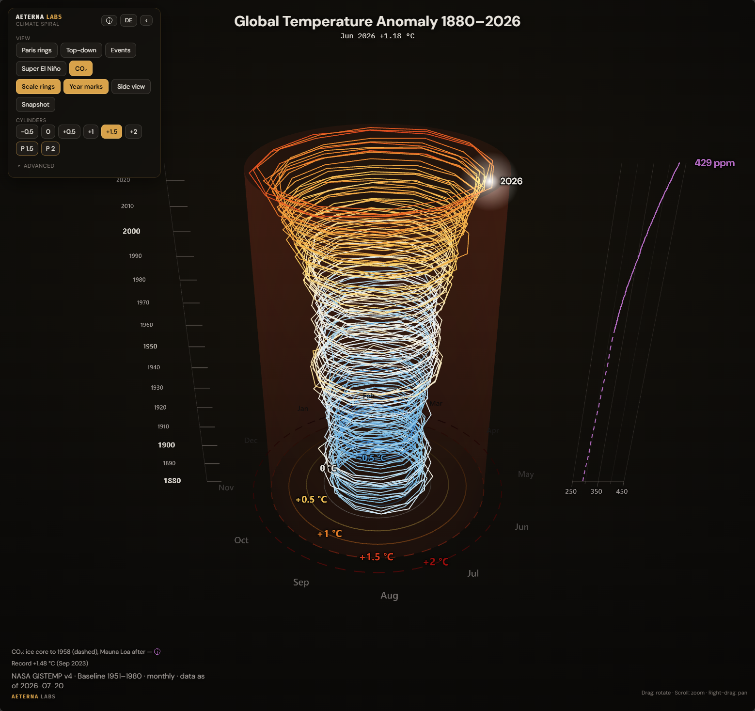
146 years of global temperature measurement, wound into a spiral: every month since 1880 a point, every turn a year, and at the end a funnel widening towards the top. Free to rotate in the browser, with the CO₂ curve alongside, Paris rings and an overlay explaining how to read the numbers.
The clip ends in 2021, the objections sit underneath it
The climate spiral has been circulating for years, usually as a reupload of a NASA visualisation whose data stops in 2021. Anyone watching it today is looking at a graphic that is five years short, with no way to check any of it themselves.
The same handful of objections shows up under every such post. The window is far too short to claim anything, the record months are just El Niño, and the baseline was picked to make the curve point upwards anyway. A finished video can't answer any of that, it simply keeps playing.
That's where this version starts. Each of those three objections got its own control on screen: the CO₂ curve for the long window, the super-El-Niño markers for the record months, the explainer overlay for the baseline.
A spiral you can turn and question
Interactive 3D spiral
The monthly values climb as a line from 1880 upwards, free to rotate by mouse or touch, with play, pause and a scrub slider across the whole series.
CO₂ next to the effect
A second curve runs beside the time axis: the ice core through February 1958, the Mauna Loa series after that. The seam between them stays visible.
Explainer overlay and Paris rings
A second pair of rings sits on the pre-industrial Paris thresholds, and the info overlay explains why the two ring sets don't line up.
What you’re looking at
The spiral starts flat, seen from above. Each month sits at its own angle in the yearly circle, the radius is its anomaly, and the colour follows the temperature value from blue through near-white to red. At the end the camera tilts and the windings spread out vertically.
What’s left is a funnel that widens towards the top, because the most recent months carry the largest deviations. The reference circles between −0.5 and +2 °C turn into translucent guide cylinders you can read that widening against.

Data and sources
The global series is NASA GISTEMP v4, the GLB.Ts+dSST dataset, with monthly values from January 1880 through July 2026. The values are anomalies against the 1951 to 1980 baseline, exactly as GISTEMP publishes them.
The Paris thresholds are a different calculation. They refer to 1850 to 1900, and getting from one baseline to the other takes an offset of +0.19 °C. On the GISTEMP scale, one and a half degrees therefore sits at +1.31 °C and two degrees at +1.81 °C. That is what the info overlay explains, along with the note that a single record month is not a target missed.
The CO₂ series comes from two sources, because no single one covers the whole span. Through February 1958 it traces the Law Dome ice core in Antarctica, after that the Mauna Loa series from NOAA’s Global Monitoring Laboratory. At the switchover the two series sit 0.57 ppm apart, and that offset stays visible: the ice-core part is dashed, the measured series solid.
The canonical monthly values live in the project as JSON, and the arrays embedded in the scene are generated from them. Before every render a check compares the two. Nothing in the embedded data is edited by hand.
This project is not original research, and I am not a climate scientist: the spiral draws published series from the institutions named above, prepared to the best of my knowledge with the method laid open. If you find a mistake, write to me.
The video versions
Alongside the interactive page, the spiral exists as rendered 4K clips, 60 seconds each at 30 frames per second, in German and English, square and portrait. They are rendered through HyperFrames, which samples the Three.js scene frame by frame from a virtual clock.
Deterministic here means no randomness, no system clock, no network calls, no dependency on screen refresh timing. Every frame follows from its position in time alone, and the same render run produces the same result twice. The CO₂ curve is deliberately absent from the clips, it belongs to the interactive version.
The remaining versions live in the video gallery: portrait instead of square, and a second variant of each format carrying the Paris rings. The 4K files and an embed snippet are there too.
How the project started
It began with a reupload in a subreddit where people show each other impressive things. The question at first was only whether the thing could be rebuilt with current numbers, and answering it took longer than the rebuild did: the animation is the easy part, verified data is not.
After that, four weeks went into the objections rather than the graphic. The baseline period, the geometry of the spiral, the El Niño question and finally the CO₂ curve were all added later, because each of them turned up as a contradiction. The series walks through that step by step.
Questions about the data or the method?
If a number, a source or a decision in the visualisation stays unclear, write to me. Every value has a source behind it, and I'm happy to name it.
Send an email →